
Pièce de monnaie en métal

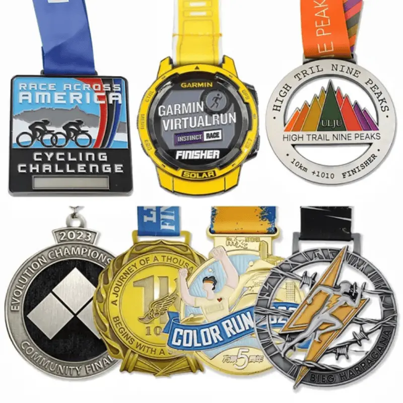
Pièce de défi pour cadeaux commémoratifs, souvent utilisée par les militaires, les entreprises et les clubs.
CONTACTEZ-NOUS
Pièces de défi personnalisées
Les pièces commémoratives peuvent être fabriquées en laiton ou en alliage de zinc. Dans les deux cas, elles peuvent être émaillées d'un émail souple, d'un émail dur imitant les couleurs ou rester vierges de toute couleur. La finition peut être brillante, mate ou antique. Généralement, les pièces en laiton sont plus lourdes que celles en alliage de zinc, ce qui peut symboliser une valeur élevée pour les unités, les coopérations ou les organisations.
Pièce commémorative A08-Metal Collective
Les pièces commémoratives personnalisées en métal sont fabriquées à partir de divers métaux tels que le cuivre, le zinc et leurs alliages, intégrant des techniques raffinées comme l'estampage, le moulage sous pression, l'émaillage et le sablage. Elles couvrent des thèmes variés, notamment les commémorations caritatives, les propriétés intellectuelles cinématographiques et culturelles, les identifications institutionnelles et militaires, et les commémorations historiques. Chaque pièce, avec ses motifs en relief, ses textes exclusifs et son savoir-faire unique, constitue un support commémoratif exceptionnel, un emblème d'identité et un vecteur de communication culturelle. Elle est ainsi idéale pour exprimer des émotions, mettre en valeur des personnalités et transmettre des valeurs.
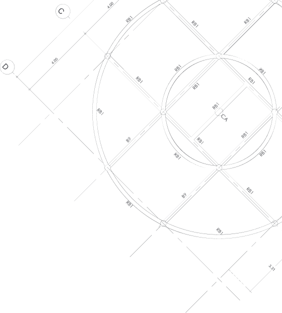
Vecteur

Processus de production

FAQ

CONCEPTION ILLUSTRATIVE
Les illustrations sont conçues selon vos exigences. Des échantillons gratuits sont fournis pour validation. Nous prenons en charge les couleurs multiples et les techniques artisanales complexes.

OUTILLAGE DE MOULES
Cycle de développement des moules court. Nous pouvons produire des moules en métal et en plastique selon vos besoins.

ESTAMPAGE/PRESSAGE/MOULAGE SOUS PRESSION
Nous proposons des procédés d'estampage, de pressage ou de moulage sous pression pour la fabrication d'épinglettes, de médailles et autres produits.

HAUTE PRESSION DE PRÉCISION
L'équipement de haute précision permet la production de produits aux formes complexes et garantit la qualité.

DÉCOUPE DE FORME
La découpe est réalisée par des machines de découpe laser ou hydrauliques, garantissant ainsi la précision du produit.

FIXATION DE L'OBJET
Différents accessoires seront fixés aux produits selon les besoins, tels que des épingles, des clips, etc.

POLISSAGE
La surface du matériau est affinée pour améliorer sa texture et éliminer les bavures.

FINITION DE PLASAGE
Diverses finitions (par exemple, or, argent) sont obtenues par électroplacage.

COLORATION
La coloration mécanique assure une répartition uniforme de la couleur et une production stable. CUISSON

Contrôle qualité et emballage
Tous les articles font l'objet de contrôles de qualité rigoureux avant l'emballage afin de garantir l'absence de défauts.

EXPÉDITION
Nous assurons l'expédition par voie maritime ou aérienne. Pour les commandes importantes, le délai de livraison est de 15 jours ; pour les commandes urgentes, nous proposons également un service express.

récent
articles de blog

How Custom Patches Build Local Fashion Identity

10
September
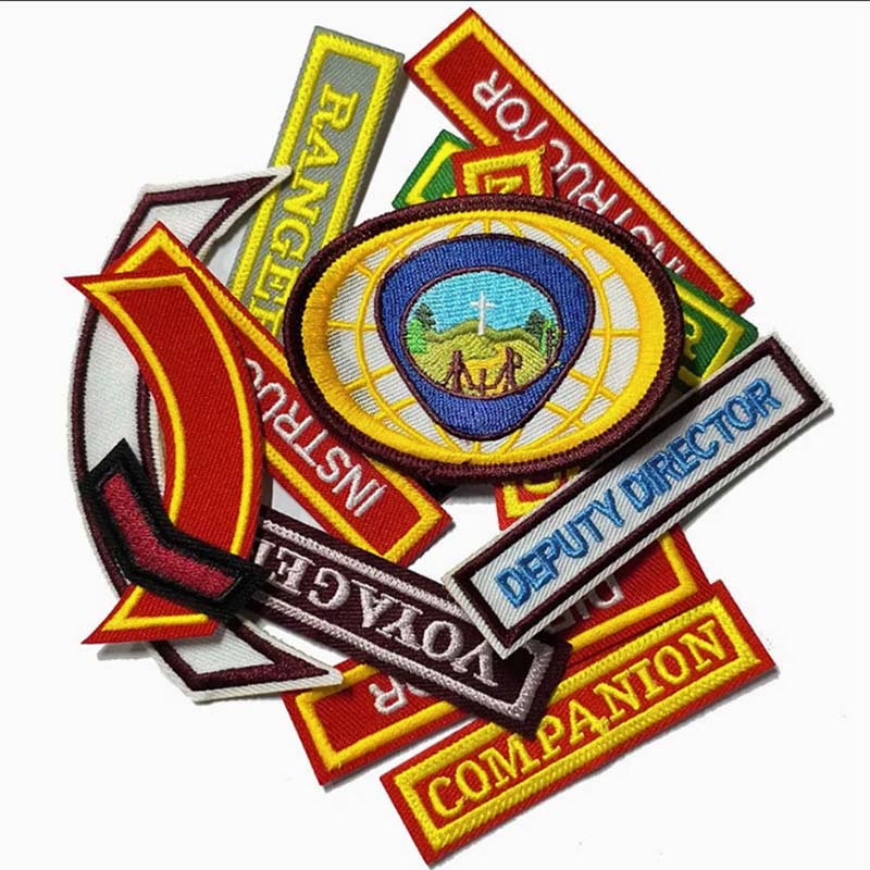
Local fashion often grows from signals people recognize across a street, a pop-up table, or a social feed. A small fabric detail can carry that signal better than another printed slogan because it feels touchable and shared. That is why patches remain useful for labels that want community identity to live on jackets, caps, bags, uniforms, and event merch. Fabric Identity Works When People Can Wear It A local label becomes easier to remember when its visual mark travels with the people who believe in it. Patches give that mark a physical edge: thread, border, backing, and placement all affect how the item feels in real use. A screen print can flatten into the garment, while a patch creates a small object on the surface of fabric. This is the practical appeal of custom embroidery patches for fashion crews, campus groups, music collectives, and neighborhood campaigns. The patch can carry a logo, mascot, phrase, date, or symbol while letting the base garment stay simple. When the same mark appears across different clothing items, the group looks connected without needing identical outfits. That sense of connection matters because local fashion is usually built through repeated sightings. A jacket worn by one person, a tote carried by another, and a cap on a vendor table can all point back to the same identity. The patch becomes the part people notice, touch, ask about, and remember. Texture Changes The Feeling Of The Message The right patch style shapes how brand identity comes across. Embroidered patches are built with stitched threads on fabric bases, delivering a raised, artisanal surface. Woven patches use fine interlaced threads, enabling crisp, flat detail for tiny text and intricate graphics. Chenille patches bring a plush, vintage-varsity aesthetic, while printed patches excel at reproducing photographic imagery and complex gradient art. Raised thread feels personal Raised embroidery works perfectly for brands aiming for warmth, heritage, and hand-crafted character. It fits club crests, minimalist icons, bold monograms, sport-inspired badges, and any design where texture carries part of the brand story. A patch is more than just a printed graphic — it adds tangible, physical character to garments. Flat detail keeps small graphics readable A woven patch becomes stronger when the design includes narrow lines, small type, or compact illustration. The surface stays smooth, so it can look cleaner on hats, technical jackets, and bags. This is especially useful when a local label needs a detailed emblem to remain legible at a modest size. Patch style Best identity use Visual effect Embroidered Bold logos, heritage marks, team identity Raised thread and classic texture Woven Small text, detailed icons, clean fashion marks Flat surface with sharper detail Chenille Varsity drops, sports capsules, nostalgic branding Soft pile and strong dimension Printed Artwork, gradients, photo-style graphics Smooth surface and full-color detail  Placement Turns A Patch Into A Social Cue Patch placement changes how people read the garment. A chest patch feels official and close to the wearer. A sleeve patch feels like a team or crew signal. A back patch behaves more like a poster, while a bag or cap patch travels through daily routines with less commitment than a full garment. The same visual mark can change mood across items. On denim it may feel collectible; on a work shirt it may feel organized; on a tote it may feel casual and public. That flexibility is why one patch for shirt program can extend into caps, backpacks, aprons, and event uniforms. Good placement avoids decoration without meaning A patch has the most value when it answers a placement question instead of filling space. The wearer should understand why the mark sits there: to identify a role, show belonging, mark a limited release, or carry the story of an event. Random placement weakens the identity. Use chest placement for names, crews, or compact brand marks. Use sleeve placement when the patch should feel like affiliation. Use back or bag placement when the artwork needs more visibility. Backing Choice Affects Everyday Use Attachment method decides whether the patch becomes permanent, flexible, or event-specific. Sew-on backing is durable for garments that will be washed often. Iron-on backing is convenient for small batches and simple application. Hook-and-loop backing lets uniforms, gear, and bags change patches by role, season, or campaign. Custom embroidery patches for heat press can support fast application when the fabric and temperature are suitable. This route fits short production windows, staff apparel, or event merch, but it still needs fabric testing because not every material reacts the same way to heat. A strong local identity should survive use, washing, and handling, not only look good on launch day. A Patch Program Needs One Clear Visual Rule Local fashion benefits from variation, but the patch system still needs a rule that holds the collection together. The rule may be a fixed border shape, a recurring thread color, a repeated icon, or a consistent placement zone. Without that anchor, the collection can feel like unrelated souvenirs instead of one community language. For teams developing embroidered promotional products, TIANYAO CRAFTS can support embroidery, woven, chenille, printed, iron-on, sew-on, hook-and-loop, and adhesive patch options across clothing and accessory uses. That range matters because the same identity may need one finish for a fashion drop and another finish for event staff, team gear, or repeat daily wear. The goal is to make the mark recognizable enough that people connect it with a place, group, or story after seeing it a few times. Practical Takeaway Custom patches build local fashion identity when they make a shared symbol easy to wear, recognize, and reuse. The strongest approach starts with the feeling the label wants to create, then chooses texture, placement, and backing around that purpose. A patch can be small, but when it appears consistently across real clothing and accessories, it can make a local brand feel present in everyday life. FAQ Are embroidered patches better than woven patches for fashion brands? Embroidered patches are preferred for designs where the company wants some texture, simplicity, and an old-fashioned look while woven patches are better for complex designs with small text and lines. Where should a patch be placed on a shirt? The position of the patch for the shirt will depend on whether the patch is used to identify the wearer, embellish the shirt, or make the design visible from a distance. Can one patch design work across jackets, hats, and bags? One design can work across several items if the shape, border, and color remain consistent. Size may need to change so the detail stays readable on each product. When do chenille patches make sense? Chenille patches become relevant when the fashion idea requires varsity style, pile material, or simple letters. Patches may not be used for small writing or complicated illustrations. Can patches be used as logo–embroidered corporate gifts? Corporate gifts that require an embroidered logo can be created using patches if the patch serves an important function as an identity symbol rather than a large billboard.
How PVC Anime Figures Become Collectible Characters

03
September
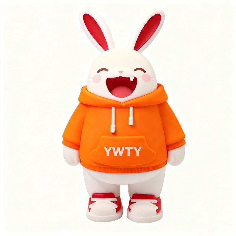
A collectible character has to feel alive before it becomes true. PVC figures do this by turning a clear expression, pose, and color story into a small object that fans can display, photograph, and recognize immediately. The useful question is how a simple design becomes a character people want to keep. Character Appeal Starts Before the Mold The strongest collectible figures usually begin with an instantly readable character idea. A rabbit with rounded cheeks, a puppy with a crown, or an anime boy with changing moods gives the viewer a reason to look twice before any technical production detail matters. The design needs an emotional hook first because production can refine a character, but it cannot rescue a weak idea. This matters because fans do not collect plastic alone. They collect a mood, a memory, a joke, a favorite character type, or a small version of a story they already enjoy. If that story is visible in the face, pose, and color palette, the figure has a better chance of  becoming more than a give away item. Silhouette and expression A figure silhouette should be special enough to recognize from the side or from a shelf. Large eyes, raised ears, crowns, props, and oversized clothing details can make a small figure easier to identify without adding fragile parts. The details should also be easily readable. Color language Color gives the figure its first emotional signal. Orange can feel lively and cheerful, green can feel fresh, and glossy highlights can make a kawaii character look more energetic in photographs and display cases. Color matching should feel planned, not random, so collectors can understand why each color exists. PVC Helps Stylized Characters Feel Durable PVC suits stylized figures because it can hold rounded forms, vivid color, and smooth surfaces without making the object too delicate. pvc anime figures often rely on these qualities when the design needs a cute appearance and approachable handling. A soft-looking form can also feel safe enough for daily display. TianYao Crafts applies this direction to soft PVC character products such as rabbit and royal puppy figurines, where custom size, colorful design, PMS color matching, paper card or gift-box packaging, and 2D or 3D effects can be adjusted to the project. Those details matter when the character line needs to look consistent across samples and mass production. Design choice Reader effect Production concern Rounded body Feels cute, soft, and easy to display Keep edges smooth and stable Large face details Makes emotion visible at small size Avoid overcrowded facial marks Color variants Encourages collecting and swapping Keep one shared character mold Production Choices Shape Fan Expectations Searchers asking how are anime figures made are usually trying to understand why the finished object can look polished or disappointing. The answer often sits in the handoff from flat art to 3D form. A strong concept needs sculpting, color planning, and sample review before it feels ready for customers. A custom pvc figure needs sculpting choices that keep the original personality design. Cute characters may need exaggerated heads, simplified hands, and clear accessories, while mascot figures may need stronger brand logo colors and a pose that works from different viewing sides. The designer should decide which details carry identity and which details can be simplified. From 2D art to 3D presence Flat artwork can hide proportion issues that become obvious in a figure. The pose has to stand or sit firmly, the face must remain visible from common display angles, and small props should not make the figure unstable. This is why a character can look excellent on screen but still need adjustment before molding. Finish and packaging cues Finish and packaging change how collectible the figure feels before it is handled. Plain OPP packaging can work for simple giveaways, while backing cards, blister packaging, or gift boxes can make a character feel more complete as fan merchandise. Packaging also helps a series look organized when several variants are released together. Collectibility Depends on Unity A single figure can be charming, but a collectible line needs consistency. PVC figures,  keychains, and small desk characters feel stronger when size, finish, eye style, and packaging logic stay related across designs. Consistency tells fans that each piece belongs to the same world. Good pvc figure design also leaves space for future variants. A puppy can change outfit colors, a rabbit can shift expression, and an anime mood character can become a set without forcing every new piece to start from zero. PVC plastic figure projects benefit from this repeatable logic because fans like recognizable worlds. They want each new piece to feel fresh, but they also want it to belong to the same shelf, bag, or display story. That balance is what turns a small product into a character series. Practical Solutions for Character Merchandise When the clarity, material texture, production details, and series logic of a character are in harmony, a PVC figure possesses collectible value. Design should first answer an emotional question: what should fans be able to recognize and feel within the first second? Afterwards, materials, surface finishes, packaging, and style planning can support this answer. For character merchandise teams, TianYao Crafts is very useful when needing custom sizes, 2D or 3D effects, PMS color schemes, practical packaging options, and ensuring production consistency for related collectibles. The most important next step is to simplify the character design while ensuring that its expression and silhouette remain clearly recognizable at the final display size. FAQ Why are PVC figures popular for anime collectibles? PVC figures are popular because they can present vivid colors, rounded shapes, and lively details in a compact and durable form, making them perfect for display on bookshelves, desks, bags, and for fan merchandise. How are anime figures made from flat artwork? The 2D artwork is transformed into a sculptural form, and after checks on posture, expression, color, and stability, it is produced according to the selected materials, surface finish, and packaging. The best effect lies in preserving the creative concept of the original work rather than replicating every two-dimensional detail. What makes a PVC character feel collectible? A collectible PVC character usually has a clear expression, memorable silhouette, consistent color story, and enough variation potential for future releases. Packaging can also strengthen the sense of a finished collectible. Can PVC figures be customized in size and color? PVC figures can be customized in size and color when the design, mold, and production method support those changes. PMS color matching helps keep character colors consistent across batches. What should be simplified in a small PVC figure? Tiny lettering, fragile props, and low-contrast facial details should usually be simplified. The important expression, pose, and colorful logo need to remain visible from normal display distance.

How to Design Eye-Catching Custom Lanyards That Boost Your Brand Impact

27
Août
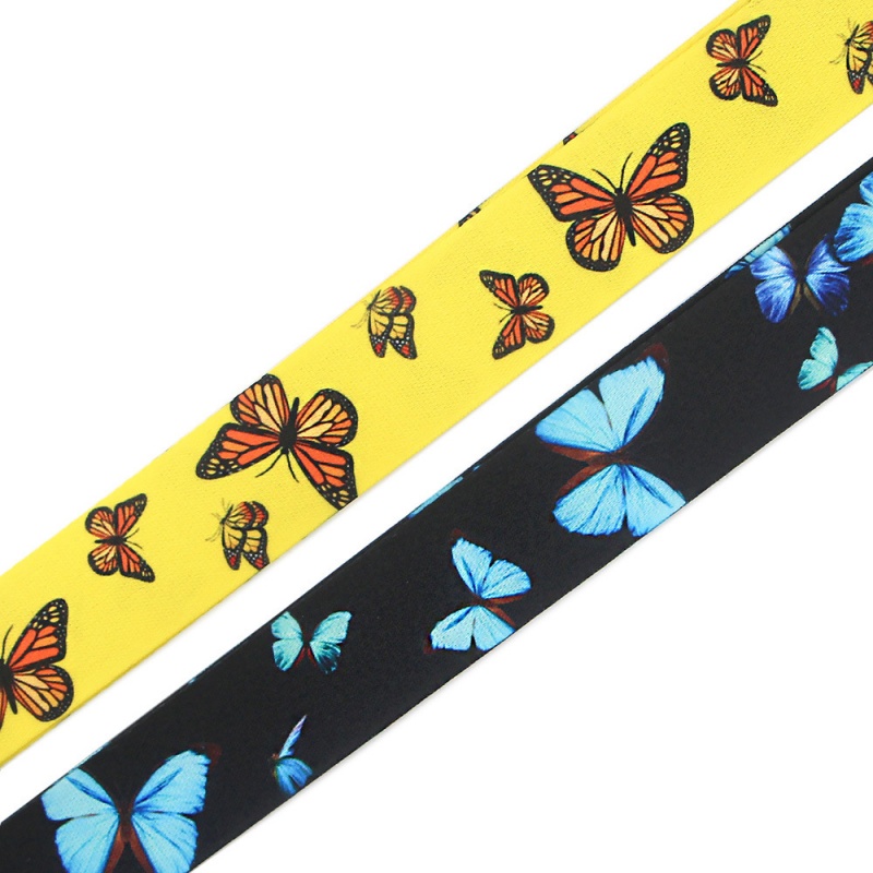
A generic lanyard is just a strap. A well-designed custom lanyard is a portable, walking brand billboard. Perfect for events, corporate offices, schools, and brand promotions, a standout lanyard balances instant brand recognition, comfortable all-day wear, and scenario-specific practicality. Here’s how to craft custom lanyards that leave a lasting impression, not just blend in. Design With a Clear Scenario & Purpose The biggest mistake in lanyard design is prioritizing aesthetics over actual usage. A lanyard for staff credentials, event guests, student access cards, or promotional giveaways serves completely different functions — and your design should match. For corporate & staff use: Prioritize high contrast, neat layout, and repeated subtle logos for quick identity recognition. For events & promotions: Adopt vibrant, themed color schemes to boost on-site atmosphere and photo visibility, turning every lanyard into a mobile brand display. Before designing, confirm your core goal: role identification, brand promotion, or thematic matching. Every design detail should serve this core purpose. Color First: Grab Attention at a Glance Color is the first visual element people notice — it defines your lanyard’s tone and brand vibe instantly. Never treat color as an afterthought to logo placement. High-contrast color combinations ensure logos and text stay readable even when the lanyard twists or moves. For a premium, low-key look, opt for coordinated soft tone pairs. For lively event scenarios, bold bright colors work best, but stick to a strict color hierarchy: 1 main color + 1 auxiliary color + 1 neutral blank area. Too many colors on a narrow strap cause visual clutter and blur your brand focus. A simple trick to test your color scheme: Stand 3-5 meters away. If your brand logo and theme are unrecognizable at a glance, simplify your palette immediately. You don’t need to use all brand colors to deliver a professional branded look. Artwork Optimization: Fit the Lanyard’s Unique Shape & Movement Unlike flat posters, lanyards are narrow, curved, flexible, and constantly in motion. Tiny fonts, ultra-thin lines, and dense icons will distort or become invisible after daily twisting and folding. Excellent lanyard design always adapts to this dynamic feature. Design Solution Best Application Scenarios Key Precautions Professional Tips Repeated large logos Corporate staff ID lanyards Overly large logos are easy to fold and block Reserve uniform spacing for repeated printing Full-color printing patterns Event & promotional lanyards Excess tiny details are prone to blurring Choose heat transfer printing for high reduction Jacquard woven patterns High-end customized premium lanyards Not suitable for photo-level delicate patterns Adopt bold and simple outline designs Color-separated strap design On-site role & area classification Similar tones cause identification confusion Use strong color contrast for clear distinction Material & Printing Process: Define Your Lanyard’s Grade Artwork determines the lanyard’s look, while materials and printing processes determine its texture, durability, and overall grade. Different scenarios require targeted matching solutions. Material selection: Polyester features stable color rendering and smooth printing effect, cost-effective for mass orders; nylon delivers soft touch and glossy texture for a premium feel; hollow woven webbing is thick and round, greatly improving wearing comfort for wide lanyards. Printing process selection: Screen printing is ideal for simple logos and single-color designs with low cost; heat transfer printing perfectly restores full-color patterns and gradient effects, perfect for themed event lanyards; jacquard weaving integrates patterns into the webbing, with outstanding durability and three-dimensional texture for high-end customized products. There is no universal “best process” — only the most suitable one for your brand style and usage scenario. All-Day Comfort = Sustained Brand Exposure A good-looking lanyard is useless if it’s uncomfortable to wear. Only when users are willing to wear it all day can your brand achieve continuous exposure. Strap width, thickness, edge workmanship, and accessory weight all affect wearing experience. Common widths (15mm/20mm/25mm) balance aesthetics and comfort differently: 15mm narrow straps are lightweight for daily wear but limit printing space; 20-25mm wide straps display logos more clearly, paired with soft materials and smooth edges for zero burden wear. Key wearable details you can’t ignore: ✅ Equip safety breakaway buckle for school, office and event scenarios to avoid snagging risks ✅ Match hooks and clips according to hanging items (ID cards, keys, reels) ✅ Avoid accessories blocking core logo and brand information ✅ Polished soft edges for long-time neck wear Final Proof Test: Fit Real Usage Scenarios Never confirm production based only on flat digital previews. Real wearing scenarios are dynamic — you need to verify the design in three real states: flat placement, worn with a badge, and distant viewing. Fold the lanyard, simulate daily twisting and wearing, and check whether the logo is always readable and the color tone is consistent. Properly simplifying redundant slogans, enlarging core color blocks, and adjusting logo spacing will make the final design more refined and professional. Final Conclusion A standout custom lanyard is not designed by random aesthetics, but by targeted matching of scenario, color, artwork, material and comfort. Every detail serves brand recognition and user experience. At TIANYAO CRAFTS, we provide one-stop custom lanyard solutions covering heat transfer, jacquard weaving, hollow weaving and nylon materials. We tailor exclusive designs for corporate, school, event and promotional scenarios, helping every client create high-value lanyards that boost brand influence. FAQ Q1: What makes a custom lanyard look professional? A professional lanyard features high color contrast, reasonable logo spacing, and scenario-matched materials. It maintains clear brand display in actual wearing scenarios, not just perfect flat preview effects. Q2: Is heat transfer printing suitable for colorful custom lanyards? Absolutely. Heat transfer printing supports full-color patterns and gradient effects with higher detail reduction than traditional screen printing, ideal for richly styled event and promotional lanyards (ensure tiny text is clear and recognizable). Q3: When to choose jacquard weaving for lanyards? Jacquard weaving is the top choice for high-end customized lanyards. It integrates patterns into the webbing for a textured, durable, and upscale look, perfect for bold logos and simple patterns (not suitable for delicate photo patterns). Q4: What is the best lanyard width for logo display? 20mm and 25mm widths are the most practical choices. They reserve enough space for complete logo display while ensuring wearing comfort. The specific width can be adjusted according to logo complexity, badge size and usage distance. Q5: Can staff and guest lanyards use the same design system? Yes. You can adopt a unified brand visual system and set obvious differences through colors, text or local patterns. It ensures a consistent brand image while realizing quick on-site personnel identification.

Comment créer une médaille personnalisée mémorable ?

20
Août
Une médaille reste gravée dans les mémoires bien après la cérémonie, car elle évoque un sentiment, bien plus qu'une simple date. Une médaille bien conçue et réalisée avec soin se distinguera assurément. Comment une équipe événementielle peut-elle transformer une récompense classique en un souvenir précieux ? Une médaille mémorable porte la signification de l'événement Une histoire claire est essentielle pour qu'une médaille soit précieusement conservée. Avant même de la concevoir, il est important de déterminer l'émotion que le récipiendaire devrait ressentir en la tenant : fierté, sentiment d'appartenance, persévérance, gratitude ou sentiment d'accomplissement partagé. Cette émotion unique guidera tous les choix de conception ultérieurs. Donnez au design une idée claire Une idée maîtresse est plus facile à retenir qu'une profusion de symboles. Une médaille de marathon peut s'inspirer du parcours, d'un lieu emblématique ou de la foulée finale ; une récompense scolaire peut mettre en valeur son blason et l'année de remise des diplômes. Le bord, le fond et le ruban peuvent alors servir cette idée sans se concurrencer. Une silhouette distinctive permet de saisir l'idée avant même que le texte ne soit lu. Une forme irrégulière de ballon de football, un portrait en relief ou un emblème découpé offrent un repère visuel et tactile. La forme doit rester agréable à tenir, avec des bords nets et précis, sans être tranchants ni inachevés. Rendre l'histoire visible en un coup d'œil Une hiérarchie claire évite qu'un design pertinent ne devienne un casse-tête visuel. Placez l'identité de l'événement et l'indicateur de réussite à un endroit où ils sont immédiatement compréhensibles, puis reléguez les détails secondaires au second plan. Les vérifications suivantes contribuent à préserver cette première impression : Un symbole central qui survit à petite échelle Un titre court ou le nom de l'événement, avec un espacement généreux. Une date, une distance, une division ou une étape importante seulement si elle apporte du sens. Une finition et une palette de couleurs qui soutiennent l'ambiance de l'événement C’est là qu’un descriptif détaillé et bien pensé d’une médaille personnalisée devient plus utile qu’une longue liste de spécifications : il explique le moment que la médaille est censée immortaliser. Des choix de conception dont on se souvient Les médailles d'événements marquent les esprits par l'harmonie entre leur forme, leur relief, leur couleur et le ruban. Chaque élément doit apporter une reconnaissance différente, sans répéter le même message. Pour les médailles de festivals, un symbole fort et central permet d'associer la récompense à l'événement plutôt qu'à un produit générique. Ce concept peut être adapté aux médailles d'événements internationaux pour toucher un public plus large. choix de conception Utile lorsque Indice de mémoire Relief en relief Un portrait, une mascotte ou un emblème doit donner une impression de tangibilité. Un détail que l'on découvre par le toucher Design unique L'événement nécessite une reconnaissance visuelle instantanée Une forme identifiable dans un tiroir Couleurs vives La cérémonie a une ambiance énergique ou juvénile Une couleur liée à la mémoire de l'événement finition antique ou satinée L'histoire requiert héritage ou formalité Une surface qui mérite d'être observée de plus près. Utilisez la texture pour attirer l'attention. Le relief 3D est particulièrement efficace lorsque le sujet présente un visage, du mouvement ou un emblème composé de plusieurs couches. Il crée des contrastes d'ombre et de lumière visibles sous différents angles, tandis qu'un traitement 2D plus plat permet de conserver la netteté d'un petit logo ou d'un texte fin. Le choix optimal dépend de l'image principale, et non d'une préférence absolue pour la profondeur. Considérez le ruban comme faisant partie de la médaille Le ruban est la touche finale de la première impression, car il encadre la médaille lorsqu'elle est portée et est généralement orné des couleurs de l'événement. Un ruban rouge confère une allure plus formelle à la distinction, tandis qu'un ruban tricolore souligne l'identité d'un sport ou d'un pays. Choisissez une palette de couleurs harmonieuse et mettez en valeur la face de la médaille. Pour les équipes qui comparent des médailles et des rubans personnalisés, il est préférable de les examiner ensemble plutôt que de les approuver séparément. Vérifiez que le ruban ne masque pas la silhouette, qu'il est bien fixé et que le verso reste impeccable lorsque la médaille est retournée lors d'une cérémonie. Veillez à ce que l'illustration reste lisible après la production. Un beau concept peut perdre de son impact si les moindres détails se révèlent irrémédiablement perdus une fois le métal coulé. La meilleure solution consiste à examiner le dessin de la médaille à sa taille finale approximative avant d'approuver le moule. Les contours fins, les caractères serrés et les aplats de couleur à faible contraste méritent une attention particulière. Remarques importantes concernant la conception graphique des médailles Une épreuve doit présenter plus qu'une simple illustration de face. Demandez à voir la profondeur proposée, le traitement des bords, le plaquage ou la finition, la fixation du ruban et une vue lisible du verso. TIANYAO CRAFT propose des effets 2D ou 3D personnalisés, des procédés de coloration, des options de plaquage et des maquettes pour approbation, ce qui permet à l'équipe de tester le concept avant la production. Examinez l'épreuve à taille d'écran normale et en petit format imprimé. Si la médaille reste lisible dans les deux cas, la hiérarchie visuelle est correcte. Si elle n'est lisible qu'en grand format, simplifiez-la plutôt que d'ajouter des ornements. L'identité de l'événement est-elle lisible sans zoomer ? Le symbole central conserve-t-il sa forme dans une vue monochrome ? Les noms, les dates et les distances sont-ils espacés du bord ? La finition crée-t-elle du contraste plutôt que des reflets ? Ces carreaux rendent la conception des médailles plus quedans un exercice esthétique : ils transforment une idée créative en un objet physique fiable. Faites perdurer le souvenir au-delà de la cérémonie La durabilité est essentielle, car une médaille commémorative est souvent exposée, manipulée, rangée et portée à plusieurs reprises. Une fabrication en alliage métallique, un plaquage ou un revêtement adapté et des points de fixation propres contribuent à préserver le relief et la couleur. La finition doit être choisie en fonction de la durée de vie prévue de la décoration, qu'elle soit conservée dans un écrin ou transportée dans une sacoche. Un chiffon doux et sec suffit généralement pour nettoyer la surface métallique, tandis que les rubans doivent être tenus à l'écart des produits chimiques agressifs et de l'humidité excessive. Une brève note d'entretien dans l'emballage de présentation indique aux destinataires comment protéger facilement leur récompense. Les points pratiques à retenir Les médailles les plus mémorables reposent sur le même principe de respect des promesses : transformer un accomplissement particulier en une représentation symbolique que le destinataire pourra voir, toucher et expliquer. Partez du récit de l’événement, concentrez-vous sur une forme, utilisez le relief et les couleurs avec parcimonie et soignez chaque détail. Lorsque le concept, le ruban et la finition véhiculent la même émotion, le résultat reste personnel, même produit en grande série. Cette cohérence transforme une récompense personnalisée en un objet que l'on expose plutôt que de le ranger. Envie de transformer le récit de votre événement en un souvenir impérissable ? Contactez TIANYAO CRAFTS pour créer des médailles personnalisées. FAQ Qu'est-ce qui rend une médaille mémorable ? Un récit précis, une silhouette reconnaissable, des détails tactiles et des informations lisibles sur l'événement offrent au destinataire plusieurs façons de s'en souvenir. Quelle quantité de texte doit figurer sur une médaille personnalisée ? Utilisez uniquement des termes qui décrivent l'accomplissement ou le moment. Des titres courts, des dates, des distances et des noms sont généralement plus efficaces qu'un slogan complet. Le relief 3D convient-il à tous les événements ? Non. Le relief est plus marqué pour les portraits, les mascottes et les emblèmes superposés. Les petits textes denses restent plus lisibles avec un traitement plus plat.  

LAISSEZ-NOUS UN MESSAGE


    Produits
    Contacts
    WhatsApp
    E-mail