


30th October 2026
Hard Enamel vs Soft Enamel Pins for Brand Merchandise
-
 작가
 작가
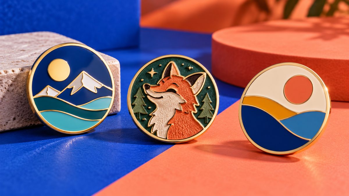
We check artwork on screen, usually zoomed in comfortably. But the pin will finally be worn on a jacket. A clean thin line on your screen may disappear on the real pin. A mockup shows what the surface may look like. It cannot tell the buyer if the design still works at its final small size.
What the Two Finishes Actually Change
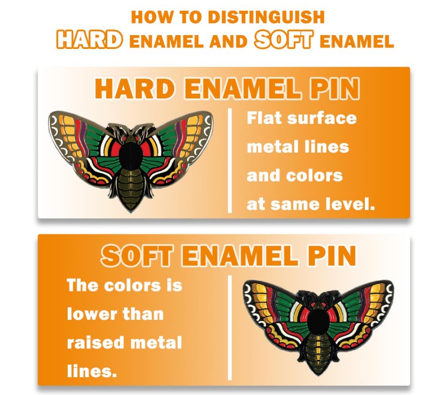
Run your finger over a soft enamel sample. The metal border stops your finger. Color sits lower, inside the metal lines. If you polish a hard enamel sample, the surface is smooth and continuous. The word “soft” often confuses people. It only means the color area is sunken. It does NOT mean the pin can bend.
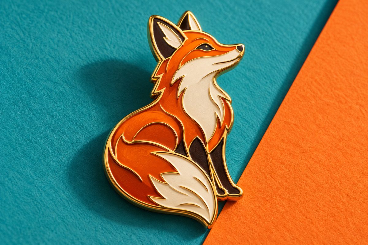
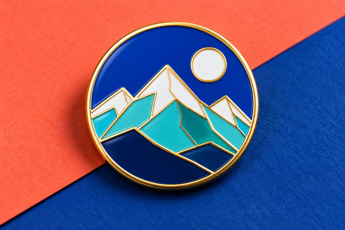
Take two designs on the same order: a lively fox mascot, and a simple geometric crest. Raised metal lines around the fox’s ears and tail make it look vivid. If you use the same thick borders on the crest, it will look messy. An anniversary crest may need a smoother, polished surface instead. We cannot say one finish is “better” or “more premium”. Each design needs a different surface treatment.
Plating, back part and pin size also change the final look. Dark borders make light color areas feel heavier. The clasp changes how the pin hangs. A small size can make thin lines disappear. You cannot judge a “hard enamel pin” only by its finish. It is like bad text on a postcard — better paper cannot fix unreadable words.
Surface Texture and Visual Character
Soft enamel catches light along raised metal edges. A mascot with clear shape looks almost 3D, especially when you tilt the pin in your hand. This textured feel works well for collectibles that people will look at closely. It does not work well if your design uses very thin lines or needs a fully smooth color surface. Dust can also collect in the sunken color areas after frequent touching.
Hard enamel gives a flat, clean surface across color areas. It makes simple crests or award marks look neat. But polishing cannot fix bad color matching. Two similar colors next to each other on a small pin will still blend together. Check color contrast first. Then choose the enamel finish.
| Decision point | 연질 에나멜 | 하드 에나멜 |
| Touch Feel | Raised metal borders, lower color | Flatter polished face |
| First impression | Relief and visible outlines | Smooth color fields |
| Promising artwork | Clear mascot or bold emblem | Restrained crest or simple mark |
| Proof question | Are the recesses even and intentional? | Are the fine borders still clear? |
To compare fairly, use the same design, size and plating. When these stay the same, you can see the real difference brought only by enamel finish.
Artwork Matters More Than the Finish Label
Text like event dates may look clear on your screen proof. On the small pin, those words turn into tiny dots. Print your design at the real pin size before you open the mold. Show this print to someone who did not join your design meetings. If they cannot read the main symbol, changing enamel finish will not help.
Small Text and Narrow Lines
Do not put too much text on a pin.
You can print the event name on the metal.
Long slogans or sponsor lists should go on the backing card instead.
This leaves enough space for your team name to read clearly on the pin.
Character pins have other risks.
At pin size, whiskers may blend into cheeks, eyebrows may blend into eyes.
Keep the key features that show its expression.
You can remove less important lines. The character must stay easy to recognize
Color Boundaries and Metal Plating
Metal border color changes how your design looks.
Light color on dark plating looks sharp.
The same light color on bright gold plating feels totally different.
The colors do not change, but the whole design feels different.
Check your plating sample together with color swatches, and on the real pin shape.
Metal edges catch light. A flat color swatch on screen cannot show this effect.
For our pin badges at https://www.ty-gifts.com/metal-badge/pin-badge , ask for a sample with your chosen plating and backing.
Pin it onto the fabric you plan to use.
You decide the color based on this real sample.
A design centered in a photo may tilt when the clasp is placed too high or low.
You need to check how it looks when worn, not only how it looks in sales photos.
Match the Pin to Its Real Use
Our pins for exhibitions only get a quick glance. Visitors walk past your booth. They notice the outline first, not the surface finish. Award pins are looked at slowly. People take them out of boxes and wear them on jackets. A simple crest can use a subtle polished hard enamel surface.
Fans may turn character pins under light to see the relief. The same pin on a backpack will rub and get touched often. Enamel finish is just one point to consider. Plating, clasp and packing also decide if the pin fits this use.
Plan your design based on how people will see and touch the pin:
- First sight: inside a gift box, at a booth, or on clothing?
- Viewing distance: Must the symbol be readable across a table?
- Use: Will people display it, wear it sometimes, or touch it often?
- Design priority: Which line or color must stay easy to tell apart?
Your event mascot and award crest can share the same colors, but use different surfaces. One brand can keep a consistent style, while each pin fits its own occasion.
The Proof Is Where the Decision Becomes Concrete
An order description that names a finish still leaves room for interpretation. The useful proof is shown at finished size, with every adjusted line visible. If a border is widened for color separation, show it on the proof at actual size. The buyer should meet that change before meeting the finished batch.
Side light can expose uneven soft-enamel fill. On the polished version, check whether the narrowest metal border still looks crisp. Look first from arm’s length, then close up, then under side light. Those three views reveal things the chosen angle of a studio photograph can hide.
TIANYAO CRAFTS makes custom metal badges and pin badges with enamel coloring, plating, and attachment options. The buyer can review the drawing and physical configuration in one piece. That approved piece, with its finish and attachment, becomes the order reference.
Keep the chosen pin beside the final artwork. A revised date or sponsor mark calls for another real-size print; it can crowd the emblem faster than expected.
Practical Takeaway
A raised border can animate a bold drawing. A level surface can quiet a formal one. Put equal-size samples against the garment or display that matters. The choice should be evident there, not only in a quotation.
For a pin program, 저희에게 연락하세요 with the artwork, planned size, quantity, and intended use. Those details are enough to identify what a sample must prove.
자주 묻는 질문
Are Hard Enamel Pins Always Better Than Soft Enamel Pins?
No. A character with strong outlines can benefit from relief, while a spare crest may suit polish. The final artwork and use decide.
Can Small Lettering Be Made in Either Enamel Style?
Small text needs enough room around each letter. If the finished-size print is hard to read, enlarge the text or move it to the backing card.
Does Soft Enamel Mean the Pin Is Soft to the Touch?
No. The pin is metal. Its colored areas sit below raised metal borders, which is why the face feels textured.
Can a Gradient Be Made With Enamel Fill?
Enamel works with defined color areas. Artwork that depends on photographic shading may need printing or a simpler interpretation.




메시지를 남겨주세요